p.s. Did you know we have a Slack community for UX localization? Join right here – and don't forget to join the relevant language-specific channels, too. Can't wait to see you there!


More to read
Great localization content in your inbox. Unsubscribe anytime.
There is a specific milestone in a product’s life that is usually cause for celebration. You have conquered your primary markets, growth is steady, and now you are ready to expand into new territories. You look at the map and see the massive potential in the Arabic, Farsi, or Hebrew market. The decision is made: "Let’s go RTL."
But for many companies, this is exactly where they stumble.
I see this constantly in my work. Whether it is a massive enterprise or a fast-moving startup, the assumption is often that RTL is just a mirror image of the Left-to-Right (LTR) interface. But "just flipping it" is not a strategy; it is a liability.
Treating RTL design as a simple reflection actively harms user trust. Research shows that poor localization makes 24% of users trust a brand less. It tanks conversion rates and pushes users to uninstall apps because the product simply doesn't feel like it was made for them.
Today, I want to walk you through a survival guide for RTL design. We are going to move beyond the basics of mirroring and talk about creating a UX system that genuinely respects how 500 to 600 million people actually read and interact with digital products.
Why "just flip it" is a failed strategy
Let’s start with the stakes. Why does this matter so much?
Imagine a Hebrew-speaking user opening your fintech app. The layout is mirrored, which is a start. But when they see a mixed sentence - perhaps an English product name inside a Hebrew instruction - the layout breaks. The English word jumps to the beginning of the line. The numbers in the verification field are reversed.
The result is that the interface feels untrustworthy. Even if the copy is technically translated correctly, the visual language is telling the user that this is a low-quality port.
Users rarely report these specific UI bugs. They don't open tickets saying "your bidirectional algorithm is failing on inline elements." They simply leave. They uninstall. They churn.
When we look at the data, the impact is clear. A study of the Arabic interface of Facebook found that users were dissatisfied and found it harder to navigate because the layout and iconography didn't match their cultural and directional expectations. Conversely, when companies like Facebook invested in proper RTL support for Instant Articles, they unlocked massive engagement from publishers and readers who could finally consume content naturally.
So, if mirroring isn't enough, what is?
Understanding the BiDi user
To design for RTL, you have to understand that your users are rarely just reading right-to-left. They are BiDi (Bidirectional) users.
Hebrew and Arabic speakers scan the page from right to left for primary content and navigation. But we live in a globalized digital world. We are constantly exposed to English, Latin numbers, and LTR code snippets. We don't just switch languages; we switch directions constantly, sometimes within the same sentence.
The technical reality of directionality
At a technical level, browsers and operating systems use the Unicode Bidirectional Algorithm to figure out which way to display text. The browser looks at the "strong" characters in a string. If the first strong character is Hebrew, it treats the paragraph as RTL. If it is English, it treats it as LTR.
This works for simple text, but it fails in complex UIs.
If you have a notification that starts with an English name like "Spotify" but continues in Hebrew, the browser might get confused about the base direction of that sentence. It might render the punctuation on the wrong side or mess up the order of the words.
This is why we need to think of RTL and LTR not as a master design and a copy, but as two sibling systems. They share DNA, but they have different rules.
The problem of "amBiDiguity"

One of the most interesting pieces of research I have come across recently is a study by Goldenberg et al. involving 1,705 Arabic and Hebrew users. They investigated how users interpret UI elements that could be read in either direction, like arrows, sliders, and progress indicators.
They found that many UI items are directionally ambiguous for BiDi users. They coined the term "amBiDiguity".
Because BiDi users are so used to LTR interfaces, they sometimes hesitate when they see an arrow. Does a right-pointing arrow mean "Go Back" (because back is to the right in RTL) or does it mean "Next" (because they are used to English apps)?
The study found that UI design factors - like the shape of the icon, the context, and the labeling - mattered more than just the user's culture . If your design is ambiguous, you are creating friction. You are making the user think about the interface instead of the task. That hesitation lowers confidence and success rates.
This is why we can't just rely on default flipping. We have to be intentional.
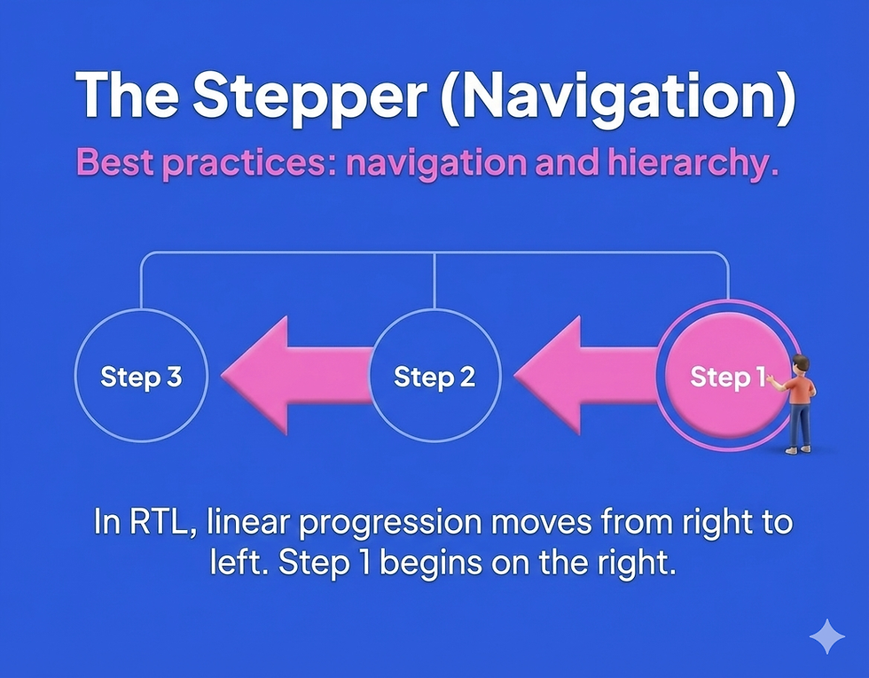
Best practices: navigation and hierarchy
Let's get into the practical details. What should you actually do with your layout?
1. Mirroring the global structure
The overall flow of the page must mirror. In RTL, the "start" of the page is the top right.
Primary navigation: The logo and the hamburger menu or primary tabs should start on the right.
Drawers and sidebars: If a menu slides in from the left in English, it should slide in from the right in Hebrew or Arabic.
Wizards and steppers: This is crucial. Steps should progress from right to left. Step 1 is on the far right. Step 2 is to its left. If you keep this LTR, it feels like the user is walking backward through a timeline.
2. Exceptions to the mirroring rule
This is where most mistakes happen. Not everything should flip.
Scrollbars: Interestingly, scrollbars often stay on the right side even in RTL layouts on many operating systems, largely due to right-hand dominance and established OS conventions.
Physical ergonomics: Think about where the user's thumb is. If a primary action is placed for easy reach in LTR, ensure it is equally accessible in RTL, but don't just flip it if it makes the reach harder.
Best practices: icons and directionality
Icons are a minefield of ambiguity. You need a strict policy in your design system for which icons flip and which stay put.
1. Icons that must flip
Any icon that implies a direction relative to the content flow must be mirrored.
Back and forward: In RTL, "Back" is to the right. "Forward" is to the left. Your chevron icons need to reflect this.
Carousels: The arrow to view the next item should point to the left.
Text editing: Icons for indentation or bullet points need to flip to show the text moving to the left.
2. Icons that must NOT flip
Some icons are universal metaphors or physical representations that do not depend on reading direction.

Media playback: This is the most common error. The "Play" button (triangle) points to the right because it represents the tape moving forward in a cassette or a timeline. It does not represent reading. Do not flip play, pause, rewind, or fast-forward icons.
Clocks and history: A circular arrow indicating "refresh" or "history" usually flows clockwise. This is a universal physical concept, not a linguistic one. Often, these remain the same.
Brand marks and logos: Never flip a logo unless there is a specific localized version provided by the brand. Text inside logos generally stays LTR.
3. Handling ambiguity with labels
To combat the "amBiDiguity" found in the research, avoid using standalone directional icons if there is room for confusion. Pair your arrows with text labels like "Next" or "Back" in the local language. The text anchors the meaning and removes the directional doubt.
Best practices: the complexity of forms
Forms are where conversion happens, and they are where RTL implementations often fall apart.

1. Label and input alignment
In a standard RTL form, the label sits on the right, and the input field is to its left. The text inside the input should generally align to the right.
However, the input direction is different from alignment.
Text fields (name, bio): These are RTL direction. The cursor starts on the right.
Numeric data (phone, credit card): While we align them to the right for visual consistency, the logic of the number is LTR.
Email and URLs: These are inherently LTR strings. A user typing an email address expects it to behave like English text. The field should be set to LTR direction, even if you align it to the right for layout harmony.
2. The search field challenge
Search is tricky. If I am searching for a product that has an English name (like "iPhone") on a Hebrew site, what happens?
If the field is not BiDi-aware, typing mixed queries can result in jumbled text.
The results dropdown needs to handle mixed scripts gracefully. If the result is an English term, it should probably be LTR aligned or isolated so it reads correctly.
You need to define clear rules for how search highlights work. Highlighting the matching string in a mixed-direction sentence requires precise coding.
3. CSS logical properties
For developers and designers who code, this is a game changer. Stop using left and right.
When you write margin-left: 20px, that margin stays on the left even when the site flips to RTL. This breaks the layout. Instead, use CSS Logical Properties.
Use margin-inline-start instead of margin-left.
Use padding-inline-end instead of padding-right.
Use text-align: start instead of text-align: left.
This allows you to maintain one single codebase that adapts perfectly to both directions.
Best practices: mixed text and numbers
This is the number one complaint I hear from native speakers: "The numbers are backwards."
1. Numbers are LTR
Let's be very clear: In modern Hebrew and Arabic UIs, numbers are written in Latin digits (1, 2, 3) and are read Left-to-Right. We do not write "321" for one hundred and twenty-three. We write "123". This means that even inside an RTL paragraph, the number itself runs LTR.
Phone numbers: A phone number like +972-54-1234567 is read LTR.
Ranges: A range like "10-20" can be tricky. Visually, you want the 10 on the right and the 20 on the left if it follows the flow of reading, but often technical implementations flip this. You need to test this specifically.
2. Isolating mixed content
When you have a string like "Package 500g (Approx)", the placement of "500g" and the parentheses can jump around if the browser is confused.
The solution is isolation.
Developers should use the <bdi> (Bidirectional Isolation) tag or dir="auto" attributes on inline elements that contain dynamic data. This tells the browser: "Calculate the direction of this specific piece of text based on its own content, and protect it from the surrounding directionality".
This is essential for things like product names, usernames, and addresses that might be in English while the rest of the UI is in Arabic.

Typography and visual language
Localizing the text is not just about meaning; it is about shape and space.
1. Font selection
Do not assume your English font has good Hebrew or Arabic glyphs. Often, the fallback font is ugly or hard to read.
You need to select a typeface that supports all your scripts harmoniously. The weight, x-height, and "personality" of the Arabic font should match the English one. If your English brand voice is modern and geometric, don't use a traditional calligraphy-style Arabic font unless that is a deliberate choice.
2. Spacing and legibility
Arabic script is often more complex vertically and requires different spacing than Latin script.
Letter spacing: In English, we often add letter-spacing for style. Never do this in Arabic. Arabic letters are connected. Adding space breaks the letters apart and destroys the word.
Line height: Hebrew and Arabic characters can be taller or go below the line. You might need to increase line height to prevent characters from overlapping or being cut off.
3. Layout resilience
RTL languages often result in text that is longer or shorter than the English equivalent. Hebrew is often more compact, while Arabic can be more expansive depending on the phrasing.
Avoid fixed-width containers.
Design your buttons and tabs to be flexible.
Test your layout with real translated text, not just "Lorem Ipsum," to see where the breaks happen.
A process for success
How do you actually implement all of this without going crazy? It comes down to process.
1. Involve UX writing and localization early
I can't stress this enough. If you wait until the design is coded to think about RTL, you are too late.
Localizers and UX writers need access to the design files (yes, give us Figma edit access!). We need to see the context. We need to see that the space for the "Submit" button is tiny. We need to be able to flag that a certain layout will break when mirrored.
2. Design parallel systems
In your design tool, don't just have one frame. Create side-by-side frames for LTR and RTL. Visualize the flow. Does the hierarchy holding up when flipped? This helps you spot those "universal" icons that look weird when mirrored before they ever reach development.
3. Test on real devices
You cannot validate RTL on a desktop simulation alone. You need to hold the device.
Does the thumb reach the back button naturally?
When you tap the input field, does the keyboard cover the text?
Do the animations feel smooth or do they fight the direction of the swipe?
Native speakers are your best resource here. They will spot the subtle "amBiDiguities" that you will miss.
Your action plan
If you are feeling overwhelmed, here is a simple way to start.
For your next feature:
Check the flow: Open your design and mentally flip it. Does the progression from step 1 to step 2 still make sense?
Audit your icons: Identify which icons in your library are directional (arrows) and which are universal (play, search). Document this.
Validate mixed text: Ask your developers if they are using isolation (bdi or dir="auto") for user-generated content.
Watch a user: Find one native Hebrew or Arabic speaker. Watch them use your beta. Don't ask them if the translation is good. Watch where they hesitate. That hesitation is your roadmap for improvement.
I hope this guide helps you navigate the wild world of BiDi design. I would love to hear your horror stories (or success stories!) about RTL localization. Drop me a note!
How to launch an RTL version of your product and survive
There is a specific milestone in a product’s life that is usually cause for celebration. You have conquered your primary markets, growth is steady, and now you are ready to expand into new territories. You look at the map and see the massive potential in the Arabic, Farsi, or Hebrew market. The decision is made: "Let’s go RTL."
Michal Kessel Shitrit
|
04/12/25

